NanoUX – Enhancing Music Discovery On-The-Go. Spotify As A Case Study
Feb 1, 2024
NanoUX, Design, Work

You are working from a cozy co-working space, soothed by some soul and jazz drifting through the speakers. As a melody fades out, you suddenly need to know the name of the song. You fumble to Shazam it - scanning your Apple Watch icons or unlocking your phone to open the app. Just as you were about to ID the track, the next song starts. And even if you catch it, you realize you don't use Apple Music, and there's no obvious way to play the Shazamed song in Spotify. Sound familiar for any music lover?
Over the years, Spotify has added many new features. One favorite addition of mine came in 2020 - a partnership with Musixmatch to show real-time song lyrics on Spotify. Whenever I come across the pain described in my co-working space story, I ponder the idea of Spotify expanding this collaboration to let users instantly identify music using Spotify itself.
Before exploring this idea, let's examine why existing options like Shazam and Musixmatch fall short.
Friction
My co-working space story illustrates the friction of juggling multiple apps to identify and play a song. Having to switch between apps takes time and leads to drop-offs. I've lost count of how often I've given up playing a Shazamed song simply because of the hassle. And when I last tried Musixmatch, I wasn't comfortable sharing extensive Spotify data with a third-party service. Which leads to my next point:
Data Privacy Concerns
Using separate services for music ID inevitably requires sharing data between them. For instance, for Musixmatch to play Spotify tracks, you must provide access to swaths of your Spotify data. No thanks - not ideal for privacy-conscious users like myself.
Data fragmentation
The issue of having music data spread across multiple apps is obvious. Music identification apps like Shazam and lyric apps like Musixmatch allow users to discover and engage with new songs. However, the inability to seamlessly access this discovery history within the primary music streaming app (in this case, Spotify) creates fragmentation. There are countless songs on my Shazam and Musixmatch apps that I wished I could access right from Spotify.
Exploring Spotify music identification as a feature
What if Spotify acquired Musixmatch, or built their own audio fingerprinting? Their partnership history makes this idea plausible. When the lyrics integration launched, Musixmatch's CEO called Spotify a "perfect match."
A partnership could cannibalise Musixmatch's core feature set, and acquiring Musixmatch outright could threaten their core business. But in an ideal world, this deepened alliance would allow instant song ID without ever leaving Spotify. For music fans, it would eliminate friction and privacy concerns in discovering music.
Before we delve into exploring this feature and possible access points, it's important to examine some key aspects of the Spotify app and the current process involved in song identification.
Home page
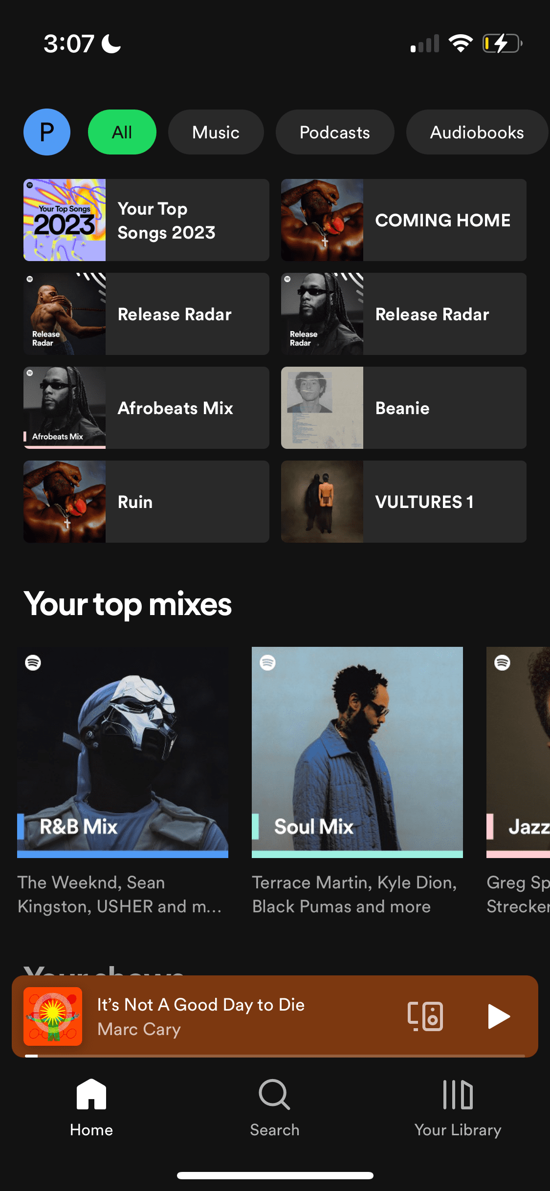
The Spotify home UI is complex, but let's look at it from a high level. The home page primarily serves as a gateway to songs in the user’s library or to algorithm-generated recommendations.
Search page
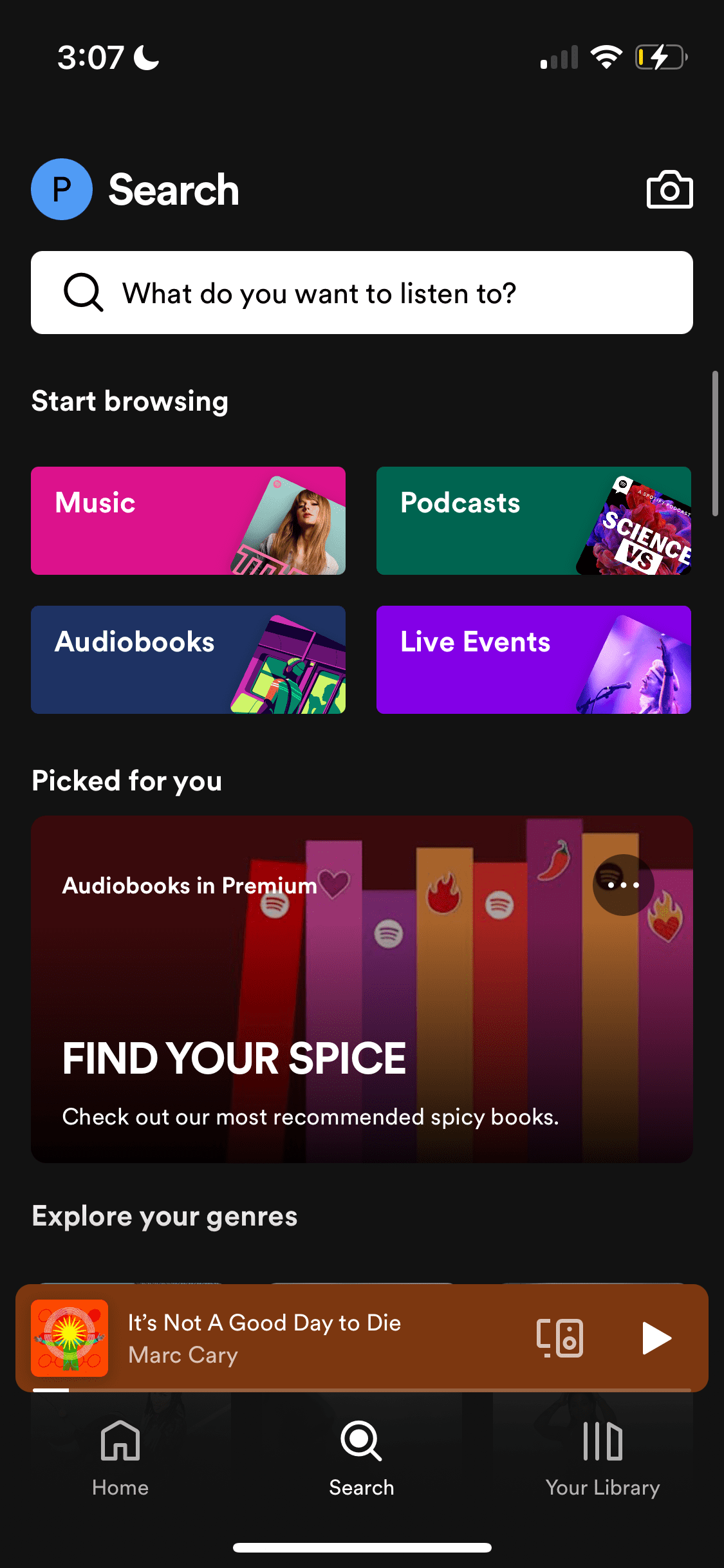
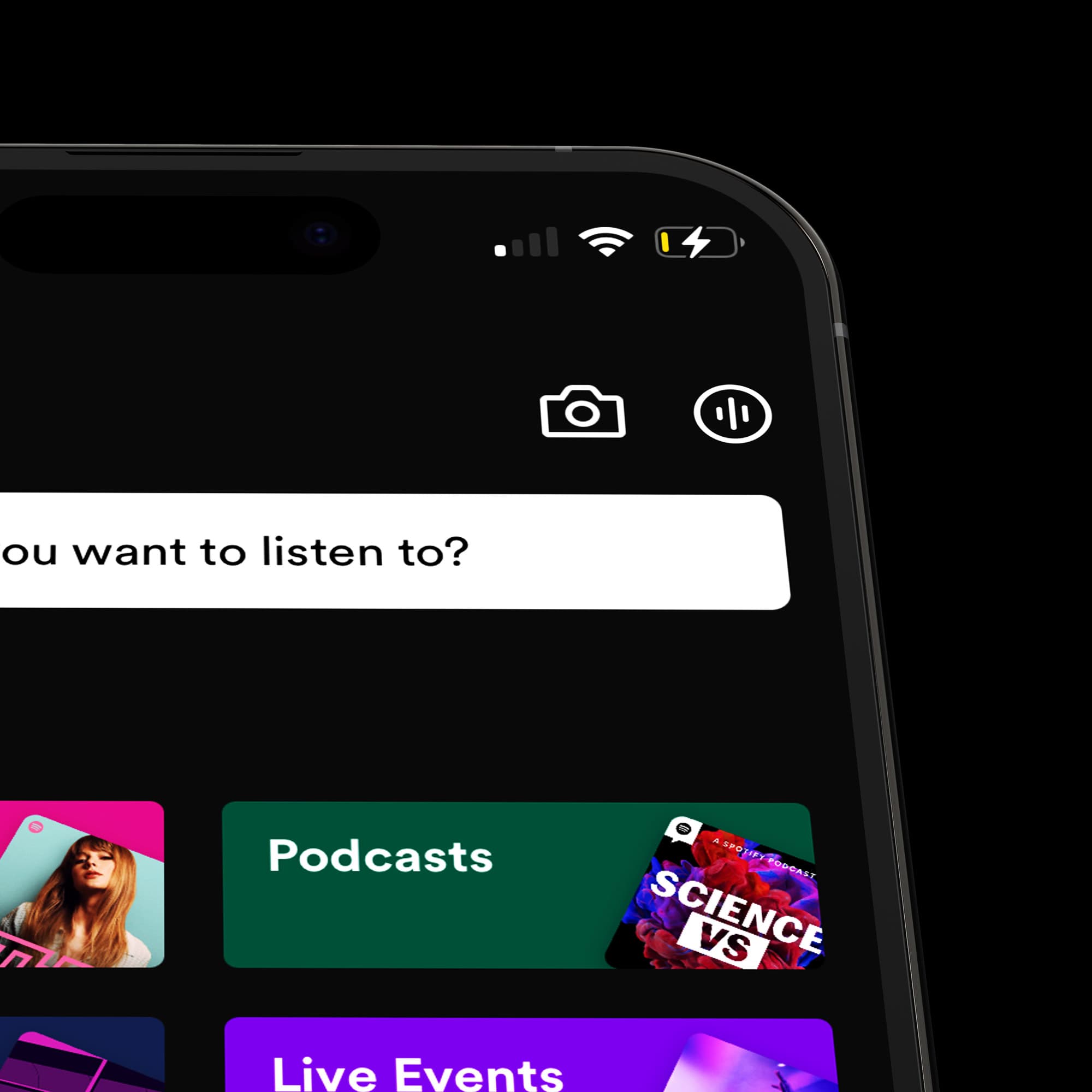
Unlike the home page, the search page is more focused on music and audio categories. A notable feature here is the camera icon, which allows users to identify a song via a Spotify QR code. Could this be a better placement for our music ID feature? We'll investigate this possibility.
Primary navigation

Spotify's bottom navigation is simplistic, offering three options: home, search, and the library. Each serves a specific purpose, from accessing recently played media to searching and managing the user's music collection.
Understanding the Passive to Active User Journey
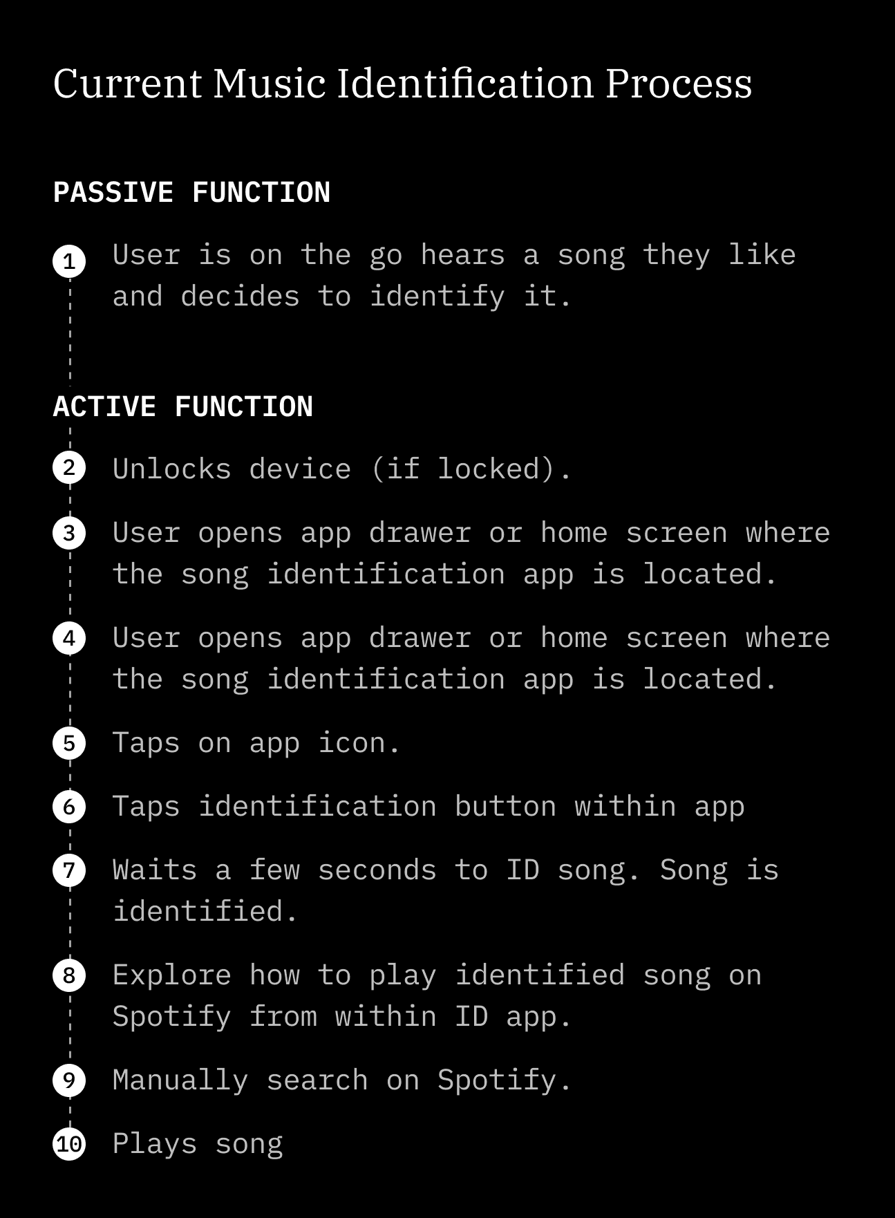
Often, the need to identify a song arises unexpectedly. Users might be on the move, relaxing, or even enjoying a party when an unfamiliar tune catches their attention. They haven't planned to identify the song, so there's no active anticipation. I call this the passive state.
When the desire to identify the song strikes, the user transitions to an active state. This involves navigating to the music identification app, launching it, and then activating the identification process. However, this transition from passive to active can be hindered by friction, leading to negative emotions like anxiety and frustration.
Design for Seamless Transitions
As designers, we should anticipate these user situations and the emotional shifts that occur during the transition from passive to active. Friction in this transition can lead to negative emotions like:
Anxiety: "I need to find this song before it ends!"
Frustration: "Where's that music ID app? Why is it taking so long?"
By minimizing friction, we can build trust and enhance the user experience. Two key aspects to consider are:
1. Speed: Enable song identification with minimal steps, ideally a single tap. Explore different access points that can trigger this action quickly, such as notification bubbles, hardware buttons, or even voice commands.
2. Reliability: Ensure the app identifies the song accurately and swiftly. A faster but inaccurate identification can be equally frustrating. Prioritize efficient algorithms and minimize processing delays.
Entry point design
Where would one expect to find this feature? Spotify's ongoing efforts to optimize its user interface have inadvertently led to what some users perceive as a cluttered UI. This complicates the integration of new features into the app.
Drawing from a previous case study I wrote, it's crucial to consider the user's context and its relevance to the task at hand when designing. For instance, the context of music discovery while on the move, as illustrated in my cafe anecdote, is worth exploring. However, to maintain brevity in these case studies, I will focus specifically on the context of on-the-go music discovery for the music identification feature.
Ideally, this feature should be easily accessible, right at the user's fingertips.
Entry point exploration 1 – App context menu
Before
After
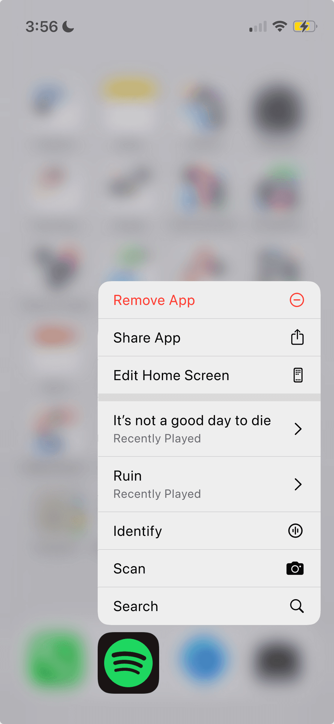
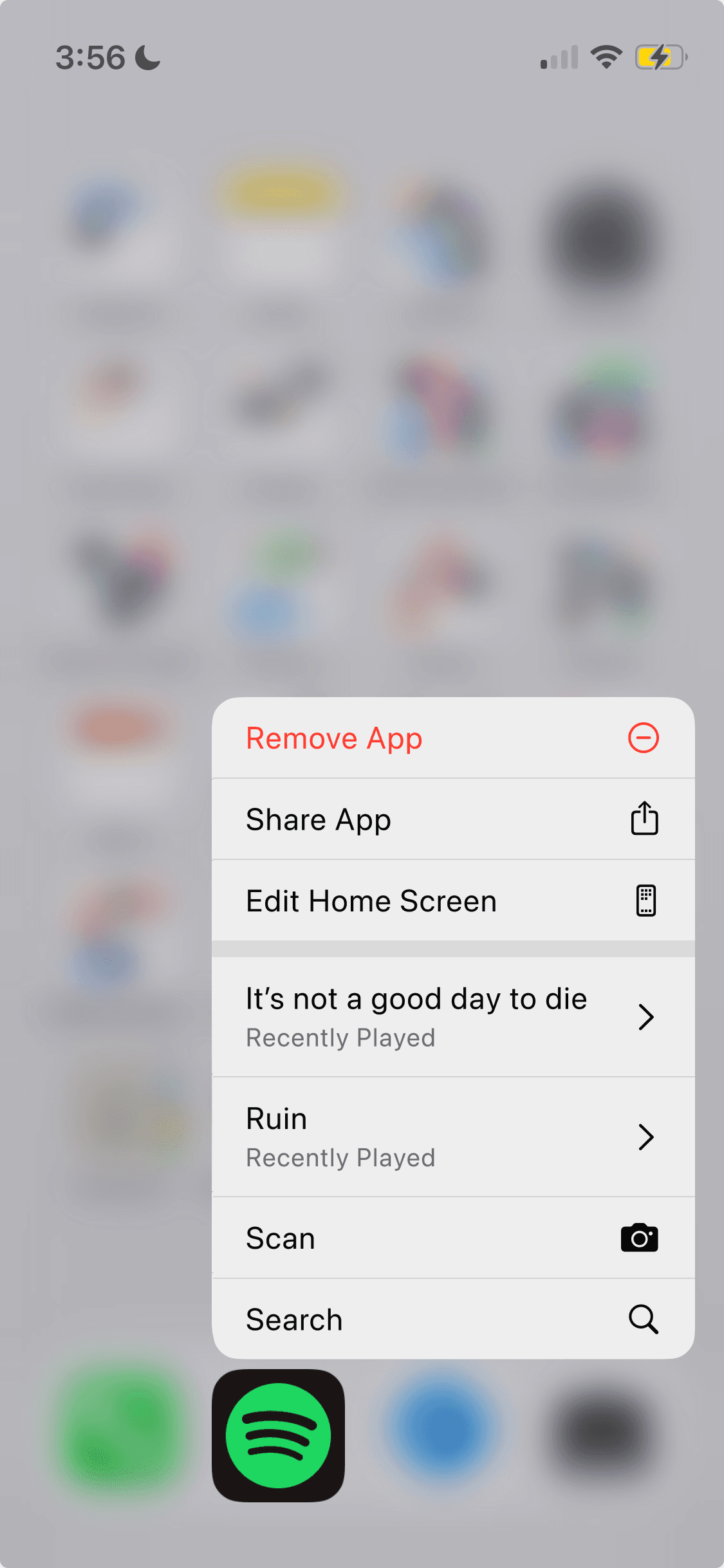
On iOS, users can long-press on app icons for quick actions. For Spotify, besides general actions like removing or sharing the app, users can play recent songs or search. Already, Spotify has included the "Scan" feature here. This could be an ideal entry point for quick music identification.
Entry point exploration 2 – Music ID as a bottom navigation item
Before

After

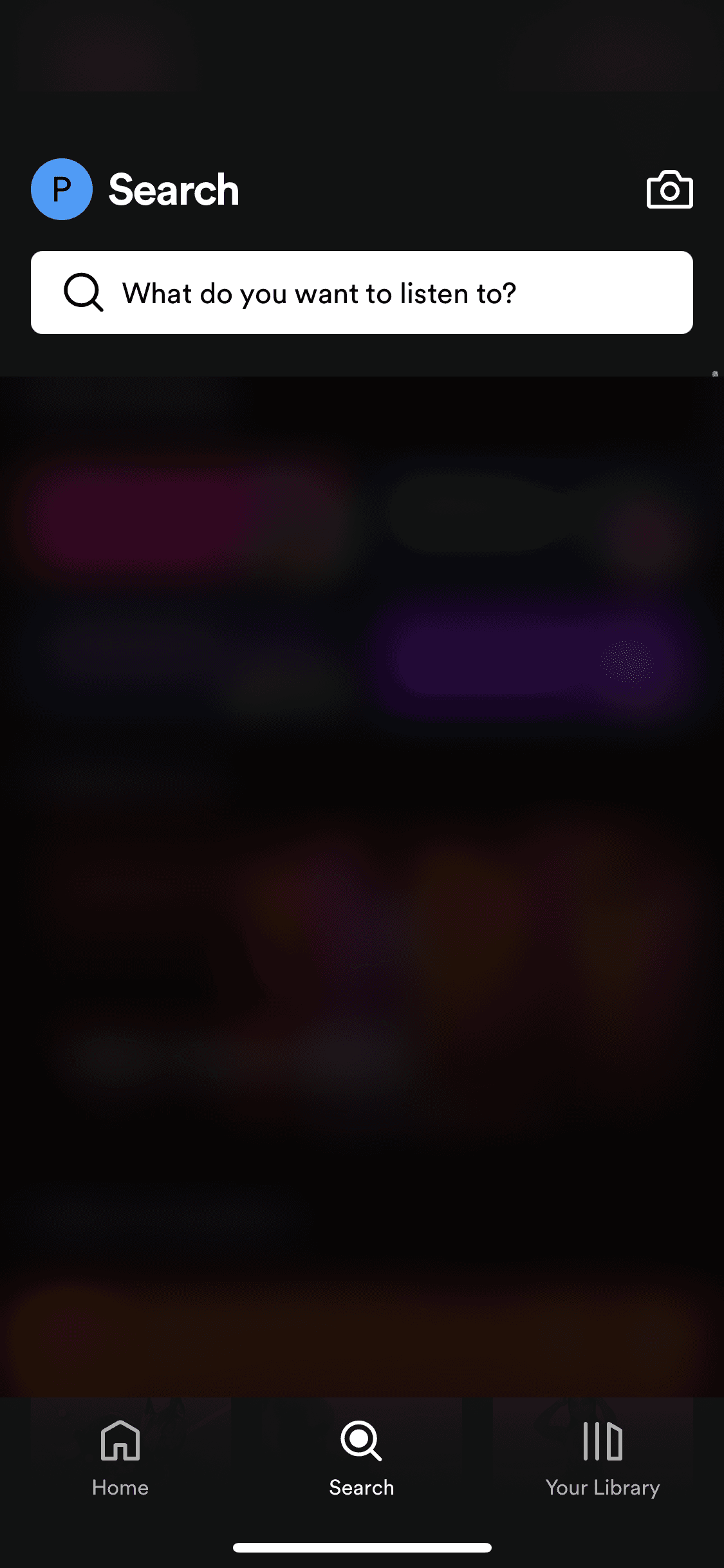
Placing the feature here would make it immediately accessible upon opening the app. However, it's worth considering if this feature merits its own dedicated tab in the primary navigation.
Entry point exploration 2 – Music ID as a bottom navigation item
Before
After
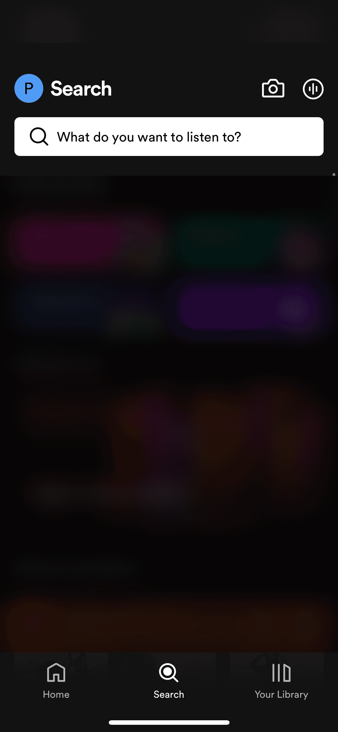
As previously highlighted, Spotify already offers a music identification feature accessible from the search page. This functionality enables users to scan a Spotify barcode, which may contain music, artist profiles, or playlists. While not as quick as having it on the home page, the search page still offers a familiar path for users.
By building upon the existing barcode scanning functionality, might we be safe to say that this is an home for a music ID feature?
Bringing it all together
Quick music identification as soon as you can find the Shopify App icon
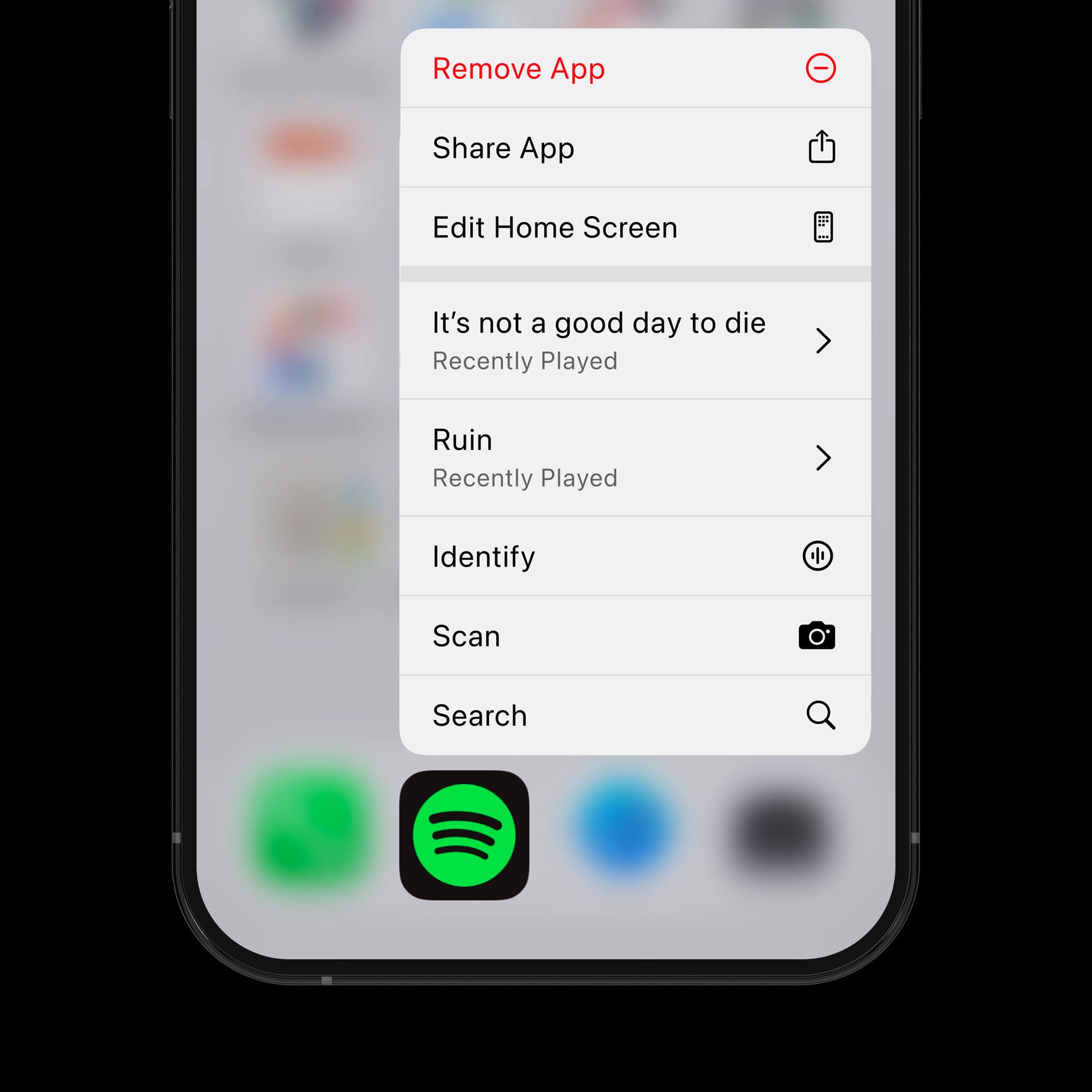
As mention earlier, iOS offers the app icon quick menu option that allow users long press on an icon the bring up contextual menu items. I beleive this is the most optimal path to music identification in our Spotify feature. The user simply long presses on the Spotify app icon which bring up the contextual menu, the use can then tap on the "Identify" action to launch not just Spotify but at the same time ID the mnusic. The eliminates the need to open the spotify app before ineracting with the feature.


Conclusion
In conclusion, integrating music identification capabilities directly into the Spotify app would provide a seamless and efficient user experience for music lovers. By eliminating the need to switch between apps, minimizing friction, prioritizing speed and reliability, Spotify can create a positive user experience.
This idea presents an opportunity for Spotify to enhance its user experience and further solidify its position as a leader in the music streaming industry.